Lesson 5: Introduction to Map Creation
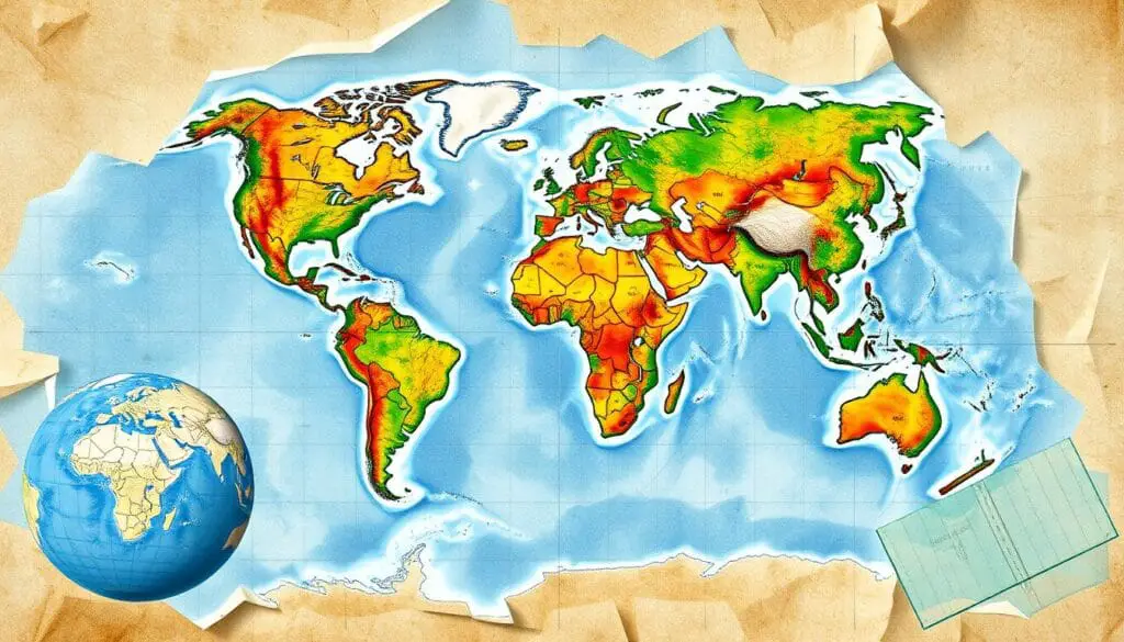
When you open a map, the world comes alive. You see roads and colors that show borders. Maps take us to new places, reveal secrets, and spark our curiosity.
In this guide, we’ll learn the basics of making maps. You’ll discover how to create maps that excite and teach others.
Table of Contents
Understanding the Fundamentals of Cartography
It’s key to geographic information systems (GIS). Maps help us see and share complex geographic info. At the heart of cartography are basic elements that make maps useful.
Basic Cartographic Elements
Maps rely on scale, orientation, and coordinate systems. Knowing these is key to making accurate maps. Scale shows how map distances relate to real-world ones. Orientation helps us understand direction and navigate the map.
Map Scale and Orientation
The scale of a map affects its detail and area. Cartographers choose the right scale for the map’s purpose. Orientation, usually aligned with cardinal directions, helps us see spatial relationships.
Geographic Coordinate Systems
Geographic coordinate systems are the backbone of maps. They help locate and organize data. Systems like latitude and longitude are crucial for mapping and data integration. Knowing these systems is vital for accurate mapping.
Learning cartography basics lets you make maps that are clear and useful. You can share spatial information effectively with your audience.
| Cartography Basics | Importance |
|---|---|
| Scale | Determines the relationship between distances on a map and their real-world counterparts, ensuring accurate representation of geographic areas. |
| Orientation | Provides a sense of direction, helping users navigate and interpret the map effectively. |
| Geographic Coordinate Systems | Enables the standardized location and organization of spatial data, facilitating accurate data collection, analysis, and map creation. |
“Maps are the most powerful visual tools we have for understanding the world and our place in it.” – Daniel Dorling, Professor of Geography
Essential GIS Software Tools for Mapping
In the world of map making, Geographic Information System (GIS) software is key. It has many features to handle, analyze, and show spatial data. Knowing what each GIS software can do is important when picking the right one for your needs.
QGIS is a top free GIS software. It has lots of features and a big community worldwide. It’s great for GIS pros and hobbyists, but it might be hard to learn at first. Also, it might not work as well with old computers or big datasets.
ArcGIS StoryMaps is easy to use and lets you mix text, media, and maps. It works well with ArcGIS, making it easy to share stories with maps. This makes it a good choice for those who want to make maps easy to understand.
| GIS Software | User-Friendliness | Analytical Capabilities | Community Support | Cost |
|---|---|---|---|---|
| QGIS | Medium | Strong | Extensive | Free |
| ArcGIS StoryMaps | High | Medium | Moderate | Subscription-based |
When picking GIS software, think about how easy it is to use, what it can do, the community support, and the cost. Knowing what each tool can do helps you choose the best one for your project and skill level.
Introduction to Map Creation: Core Principles
Creating a map is more than just drawing lines on a page. It’s about understanding the basics of cartography. The three main parts are data collection methods, spatial analysis basics, and quality control in mapping. Knowing these well is key to making maps that show geographic information clearly.
Data Collection Methods
Getting the right data is the first step in making a map. You can use field surveys, remote sensing, or even crowdsourcing. It’s important to make sure the data is reliable and complete.
Spatial Analysis Basics
This means finding patterns and connections in the information. Tasks like overlay analysis and buffer creation are part of this. Knowing how to do these helps turn data into useful maps.
Quality Control in Mapping
It’s vital to check the map’s accuracy and reliability. Cartographers must use strict quality control steps. This includes checking data, finding errors, and getting feedback. This ensures the map is trustworthy and useful.
By following these core principles, cartographers can make maps that are not only good-looking but also informative. Using these best practices helps create maps that are valuable and stand out.
Map Projections and Coordinate Systems
Cartographic techniques are key to showing the Earth’s shape on a flat map. Map projections are the math behind this. They turn the Earth’s three dimensions into two. Knowing the strengths and weaknesses of different projections is vital for picking the right one.
There are dozens of map projections in ArcGIS, each with its own traits. The right coordinate system depends on the map’s area, scale, and use. Projections change the grid of latitude and longitude lines, affecting how data looks on the map.
| Projection | Characteristics | Applications |
|---|---|---|
| Equal Earth | Designed to show the entire world, but can’t effectively map two parts of the world simultaneously. | Suitable for world maps where preserving the relative sizes of regions is important. |
| North Pole Azimuthal Equidistant | A polar equidistant projection that preserves distances from the North Pole. | Useful for maps where distance assessment from the North Pole is crucial. |
| Mercator Projection | Introduced by Gerardus Mercator in 1569, emphasizes angle preservation but severely distorts areas. Greenland appears as large as Africa in this projection. | Valuable for global navigation, but not suitable for accurately depicting relative sizes of regions. |
| Robinson Projection | Developed by Arthur H. Robinson in 1963, aims to balance area, shape, and distance distortions, making it suitable for world maps. | Appropriate for thematic mapping and general-purpose world maps. |
Choosing the right coordinate system and map projection is crucial. Cartographers must weigh the trade-offs of distortions and EPSG codes against the map’s purpose. The search for the most accurate map goes on, with new methods and tech helping to show the Earth’s complex shape on a flat surface.

“The choice of map projection is a critical decision that must be based on the specific needs and purpose of the map being created.”
Data Sources and Integration Methods
In the world of mapping, having many data sources is key. It’s also important to integrate them well. This makes sure your maps are accurate and useful. From vector data to raster data, and combining them with databases, it’s all about how you source and integrate data.
Vector Data Management
Vector data shows exact shapes of places. It’s made up of points, lines, and polygons. Managing and mixing vector data well is crucial for detailed maps. You might need to clean the data, change its format, and analyze it to fit your map needs.
Raster Data Processing
Raster data, like satellite images, adds depth to your maps. It’s great when combined with vector data. To make your maps look good, you’ll need to process raster data. This includes steps like resampling, color correction, and tiling.
Database Integration
Using database integration helps manage lots of data for maps. It lets you store, get, and update data easily. This makes your maps dynamic and data-rich. It also keeps your data reliable and accessible, helping you make smart decisions.
| Data Source | Characteristics | Integration Considerations |
|---|---|---|
| Vector Data | Precise representation of geographic features | Data cleaning, format conversion, spatial analysis |
| Raster Data | Satellite imagery and aerial photographs | Resampling, color correction, tiling |
| Database Integration | Efficient storage, retrieval, and update of mapping data | Ensuring data integrity, accessibility, and reliability |
By managing and mixing these data sources well, you can make maps that are both beautiful and informative. Learning to integrate vector, raster, and database data is key to making your maps the best they can be.
Principles of Map Design and Layout
Making a good map is more than just putting down where things are. It’s about knowing how to design and lay out a map. These skills will help you make a map that looks great and works well.
The process of making a map is complex and keeps changing. First, you need to know why you’re making the map and who it’s for. Then, you pick the right scale and data to fit your goals.
- It’s important to simplify and organize data to make the map easy to read and look good.
- Choosing how to arrange the map’s parts is a big deal. You’ll try out different ways to find the best one.
- Getting the layout right is key. You want everything to look good together and guide the viewer’s eye.
Getting feedback from others can really improve your map. The goal is to make a map that clearly shares your message and grabs the audience’s attention.
| Cartographic Design Step | Key Considerations |
|---|---|
| 1. Define map purpose and audience | Determine what needs to be communicated and how to best facilitate the communication of ideas. |
| 2. Choose appropriate map scale | Determine the ratio of map distance to distance on the ground. |
| 3. Address data, format, printing, and economics | Consider the type of map, data requirements, display methods, and production costs. |
| 4. Abstract and generalize data | Use methods like simplification, selection, classification, and symbolization. |
| 5. Design the map layout | Experiment with different options to find the optimal arrangement of elements. |
Learning about map design and layout will help you make cartographic designs that are both beautiful and effective.

Thematic Mapping Techniques
In the world of data visualization, thematic mapping techniques are key. They help us share geographic information effectively. Tools like choropleth maps, heat maps, and point density maps reveal patterns and trends. They give us valuable insights.
Choropleth Maps
Choropleth maps show data in geographic areas like states or countries. They use colors to show data intensity. These maps are great for showing population density, sales, and demographic data.
Heat Maps
Heat maps use colors to show data density. They’re useful in sales and marketing to find market opportunities. They’re also good for crime and temperature analysis.
Point Density Maps
Point density maps use dots to show data. They’re good for spotting patterns and showing data density. They work well even in black-and-white.
Whether you’re in data analysis, marketing, or public sector, thematic mapping is crucial. It helps you make informed decisions. By choosing the right technique, you can create powerful visualizations.
Choosing a thematic mapping technique depends on the map’s purpose and color schemes. An appropriate basemap adds context. These tools turn data into stories that inspire action.
Digital Cartography and Web Mapping
In today’s digital world, cartography has changed a lot. The old art of mapmaking has evolved into digital cartography and web mapping. We’ll look at the new advancements and trends in these fields.
Web-based mapping has changed how we make, share, and use maps. Online map creation tools let many people, from experts to hobbyists, make cool, interactive maps. These tools work well with geospatial data, making it easy to add different data and create custom maps.
Digital cartography lets us make interactive maps that are fun to use. Web mapping tools like Leaflet and Mapbox add cool features like zooming and data layers. This makes maps more fun and useful for users.
The world of digital cartography is always getting better. We’re seeing new innovative techniques and tools that go beyond old mapmaking. Things like real-time data and augmented reality are changing how we see and understand the world.
Whether you’re a pro cartographer or just curious, the new stuff in digital cartography and web mapping is exciting. It lets us make, use, and share maps in new ways. As we keep using these new tools, how we see and talk about places will change a lot.
“The map is not the territory. The map is not reality itself, it is an abstraction of reality.”
– Alfred Korzybski, Polish-American philosopher and scientist
Map Visualization and User Interface Design
Creating engaging map visualizations and user-friendly interfaces is key in digital cartography. Interactive elements and color theory help make maps that grab users’ attention. They also clearly show spatial information.
Interactive Elements
Modern map interfaces rely on interactivity. Interactive features let users dive deeper into the map. Some important elements include:
- Zooming and panning to move around the map
- Popup windows or tooltips for extra info on hover or click
- Toggleable layers to customize the map
- Dynamic filtering and sorting to refine data
- Animation effects to show changes or patterns
Color Theory in Maps
Color plays a big role in map design. It affects how easy the map is to read and understand. Using color theory can make maps look good and work well. Here are some tips:
- Think about color blindness and offer high-contrast options
- Avoid similar colors for nearby areas
- Color gradients are great for showing continuous data
By focusing on map visualization and design, you can make digital maps that inform and engage. Interactive features and careful color choices can make your maps stand out. They offer a better user experience and deeper spatial analysis.
| Software Tool | Key Features | Suitable For |
|---|---|---|
| Google Maps Platform | Wide data coverage, seamless integration | Diverse mapping needs, developers |
| QGIS | Free, open-source, advanced analysis | GIS professionals, spatial analysts |
| Mapbox | Custom design features, interactive maps | Developers, designers |
| ArcGIS Online | Cloud-based, rich content library | Businesses, organizations |
| Canva Maps | Easy to use, pre-designed templates | Non-technical users, quick map creation |
Best Practices for Map Production
Making high-quality maps needs following key cartographic best practices. The map production journey requires attention to detail and a focus on accuracy and clarity. It’s important to keep everything consistent.
Start by making sure you have all your data collected and prepared well. Check your sources and make sure your data is correct and in the right format. Use spatial analysis to find important patterns in your data.
- Use strict quality assurance steps in your mapping work. Check your work often, test for mistakes, and ask for feedback.
- Focus on the design and composition of your maps. Use color theory, typography, and visual hierarchy to make maps that are both useful and nice to look at.
- Make sure your maps work well in different output formats. Whether for print, digital screens, or web, your maps should look good and work well everywhere.
Following these cartographic best practices can improve your map production quality. This way, you can make maps that clearly show complex spatial information to your audience.
“Effective cartography is not just about technical skills, but also a deep understanding of how people perceive and interact with spatial information.”
Conclusion
Exploring map creation has deepened your understanding of cartography. You’ve learned key GIS software tools and map design best practices. These skills will help you in the changing world of mapping.
The history of cartography shows amazing progress in collecting, analyzing, and showing spatial data. By using technology and improving your cartography skills, you can make maps that are accurate, beautiful, and easy to use. These maps meet the needs of today’s digital world.
The future of mapping is bright. New technologies like GPS, satellite images, and cloud platforms make map-making easier and more accessible. As a mapmaker, stay curious and keep up with cartography’s changes. Your work will help shape how we see and interact with our world.

